Shell For Wem — Brand identity by Ziang Chen

Art direction & design

Fashion imagery generated with AI for concept presentation only.

Ziang Chen

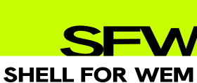
Logo / SFW / Lockup / Primary

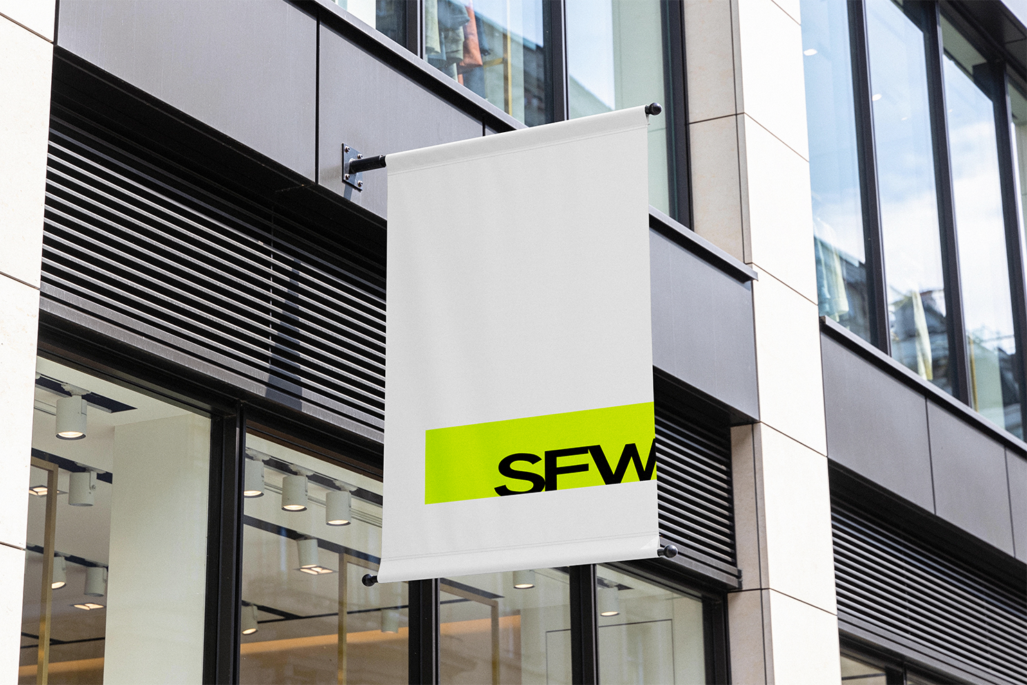
Shell For Wem is a contemporary fashion label that explores the tension between everyday dressing and experimental expression. Its visual identity balances fluorescent green, unconventional typography and controlled studio photography with structured layouts, creating a distinctive and consistent language across digital and physical touchpoints.

Logo / SFW / Lockup / Primary
Logo / Alternate lockup

Logo

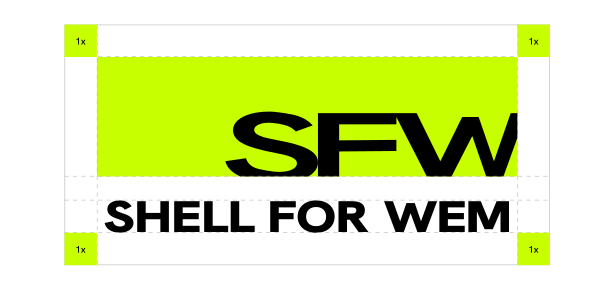
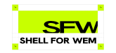
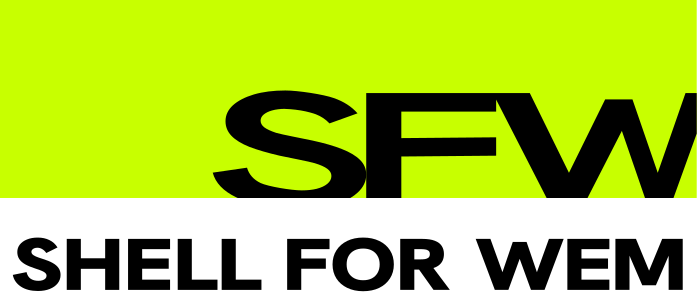
The logo is built around the concept of a “Shell”—a defined boundary that establishes structure while allowing room for variation. Within this framework, letterforms are stretched and cropped, transforming familiar typographic forms through shifts in proportion and creating visual tension.

​

Logo / Clear space diagram / 1x. 1x 1x 1x 1x

Visual System

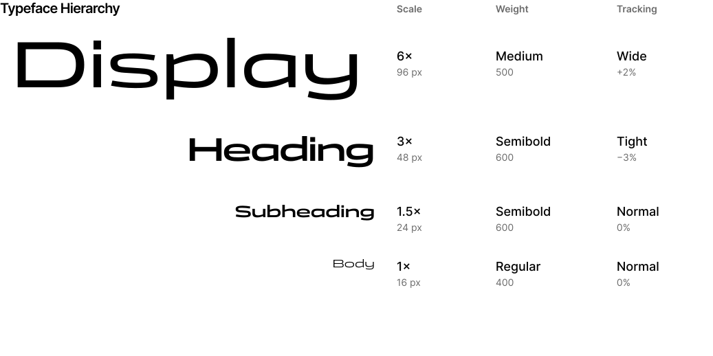
Typography · Borderless specification. Scale Weight Tracking Display Medium 500 Wide +2% Heading 3× 48 px Semibold 600 Tight −3% Subheading 1.5× 24 px Semibold 600 Normal 0% Body 1× 16 px Regular 400 Normal 0% 6× 96 px Typeface Hierarchy

Hex: C8FF00

Pantone: 2297C

Panchang

Hanken Grotesk

Primary Typeface

Secondary Typeface

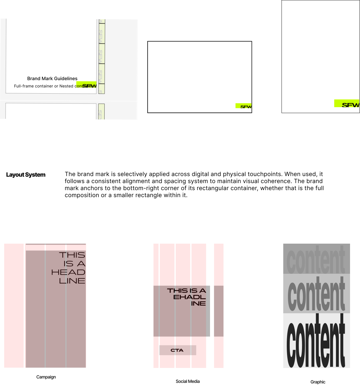
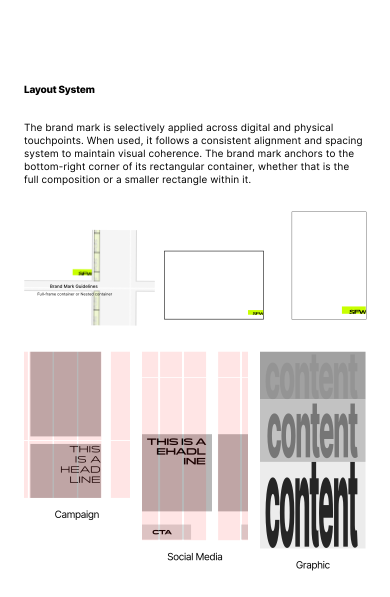
05 / Layout system & brand mark guidelines. The brand mark is selectively applied across digital and physical touchpoints. When used, it follows a consistent alignment and spacing system to maintain visual coherence. The brand mark anchors to the bottom-right corner of its rectangular container, whether that is the full composition or a smaller rectangle within it. Brand Mark Guidelines Layout System Campaign Social Media Graphic Full-frame container or Nested container
SFW / Cropped field

Social Media

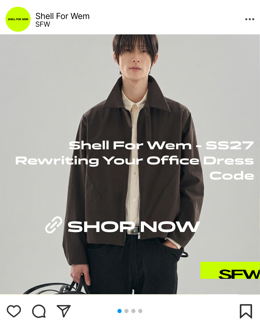
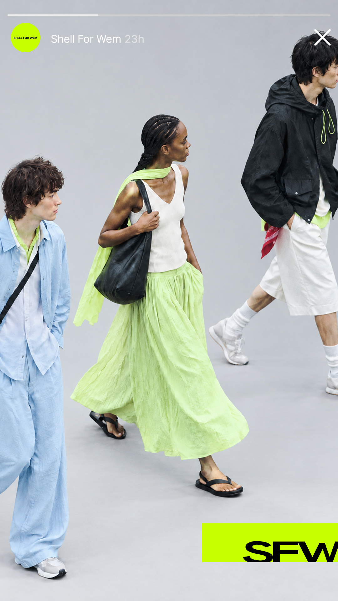
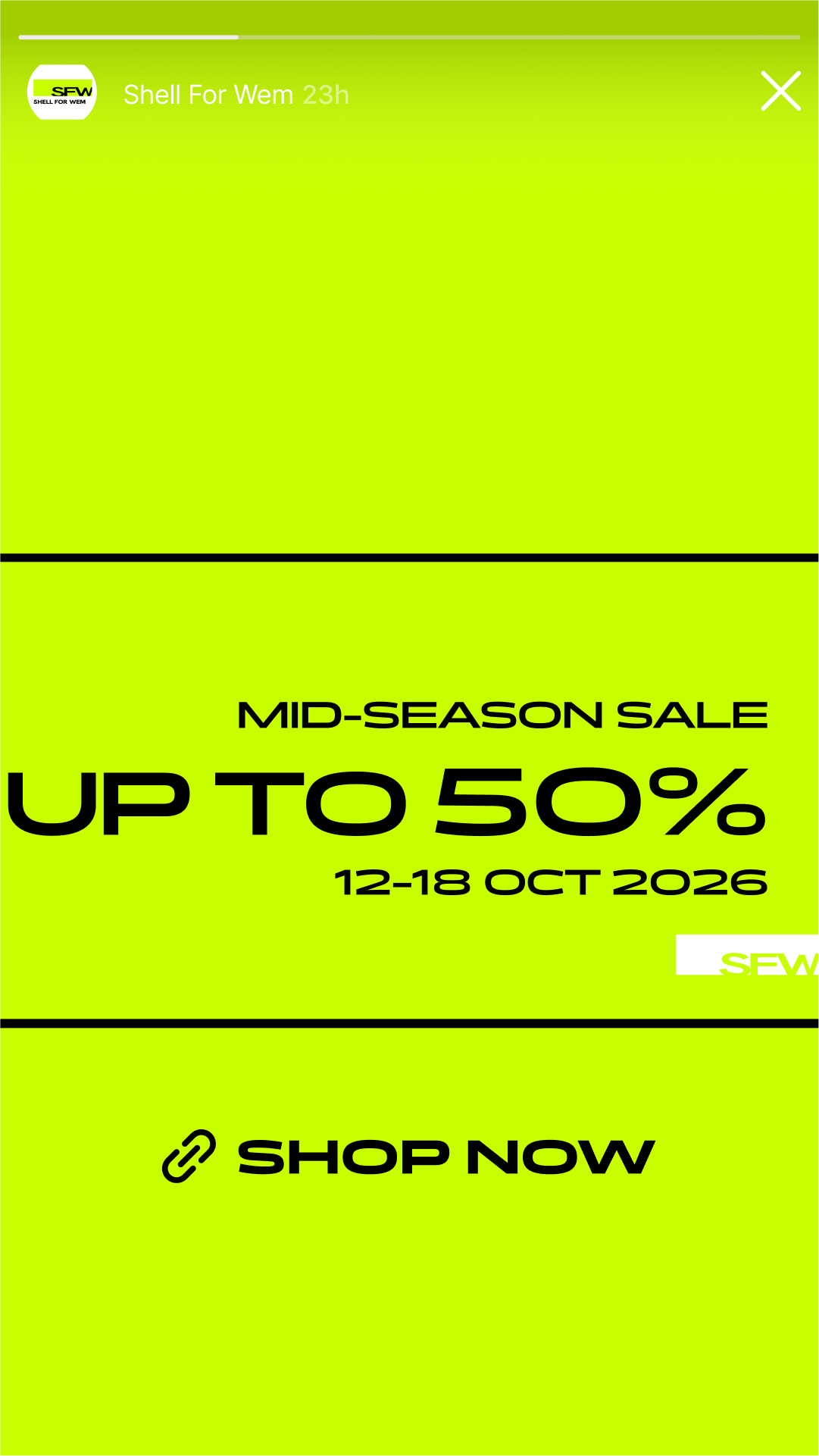
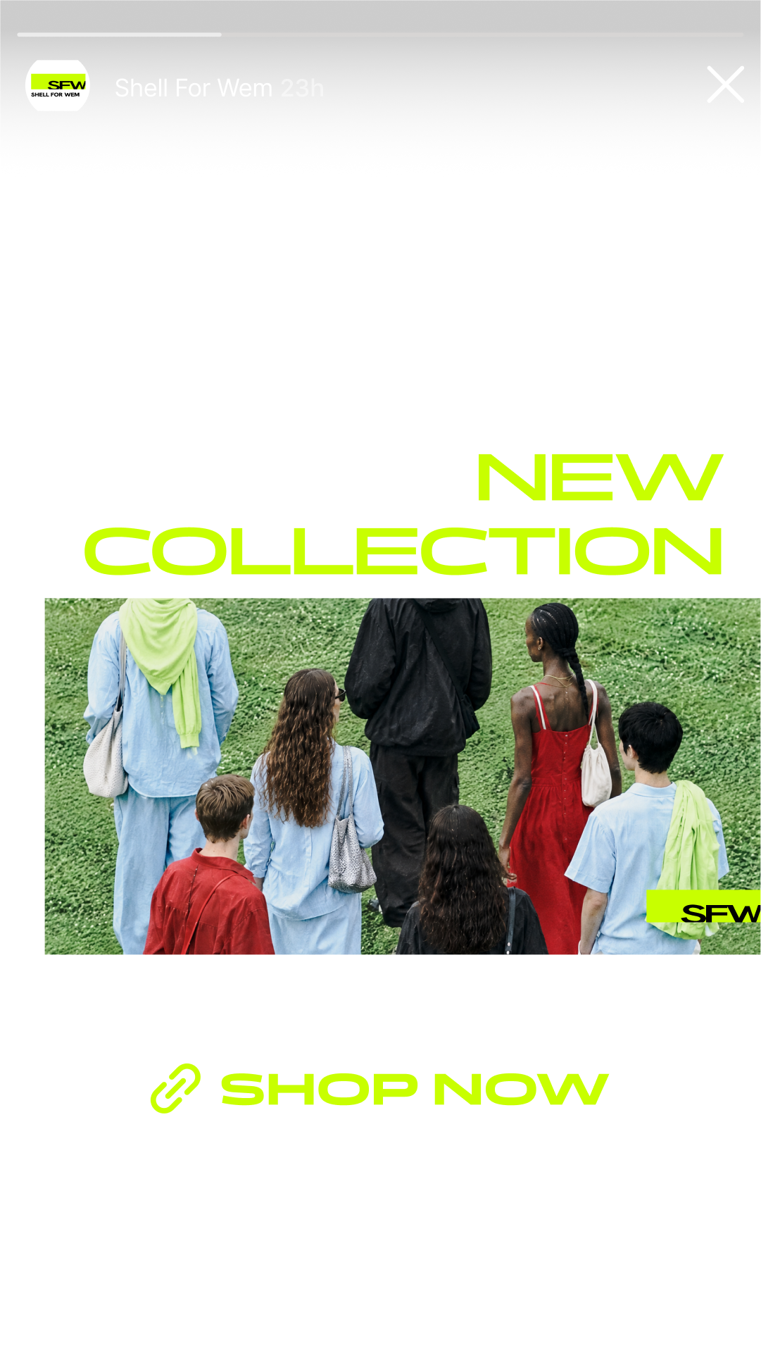
Layouts, typography and imagery are adapted from the templates to suit different content and communication needs, maintaining a recognisable brand identity while allowing flexibility across posts and stories.

Campaign

​

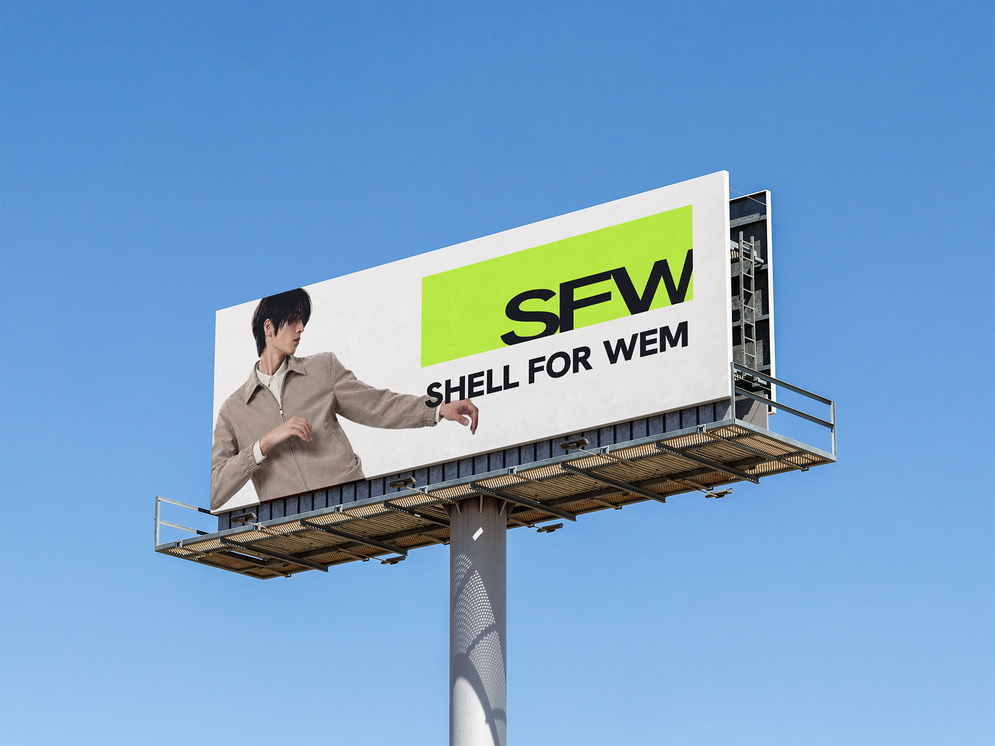
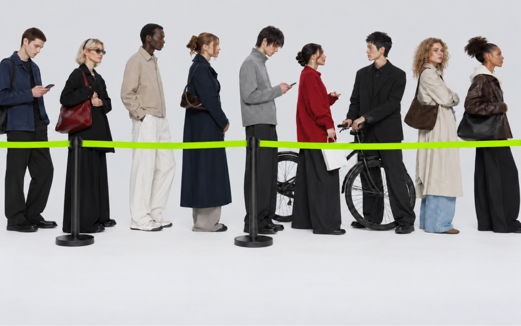
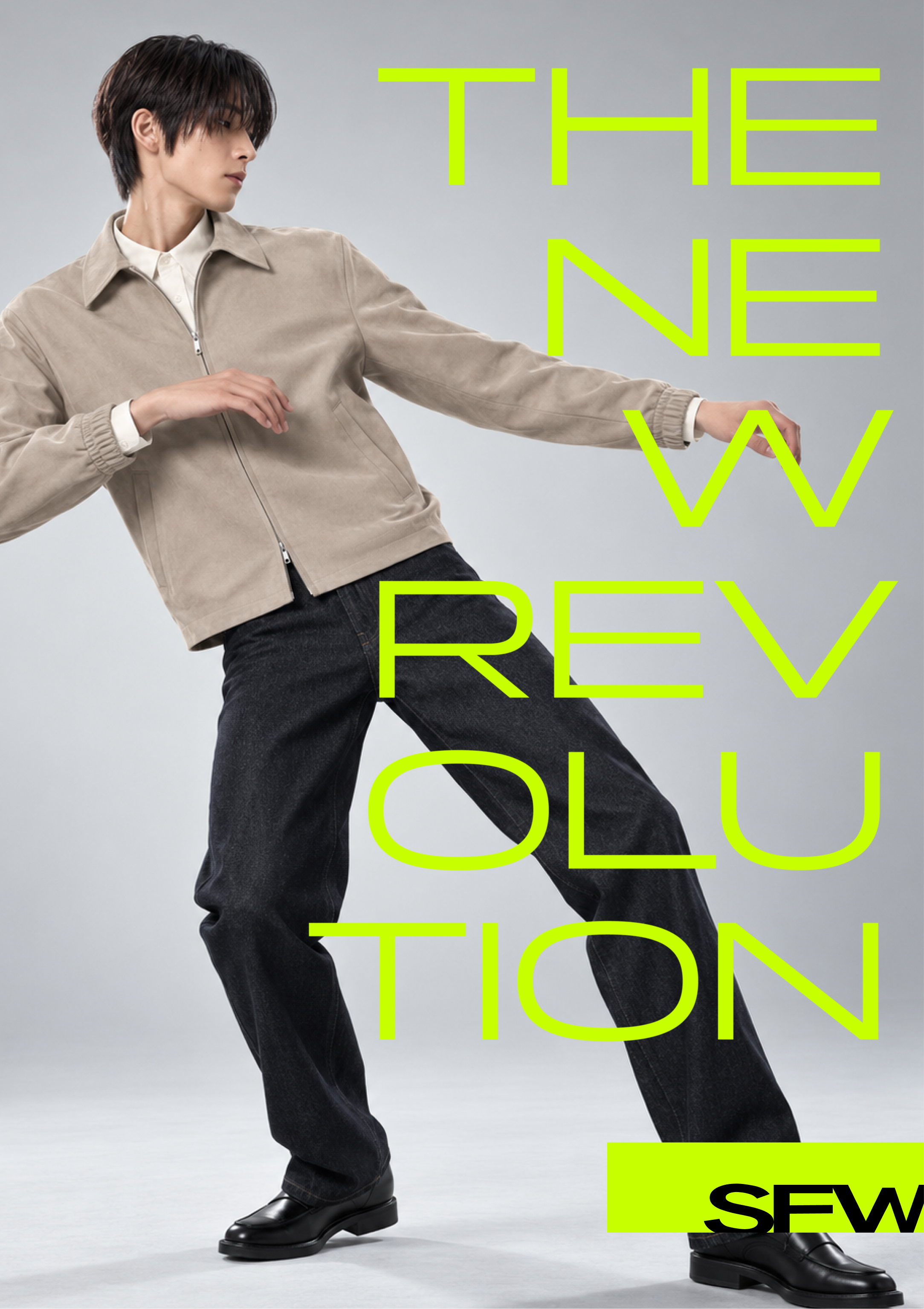
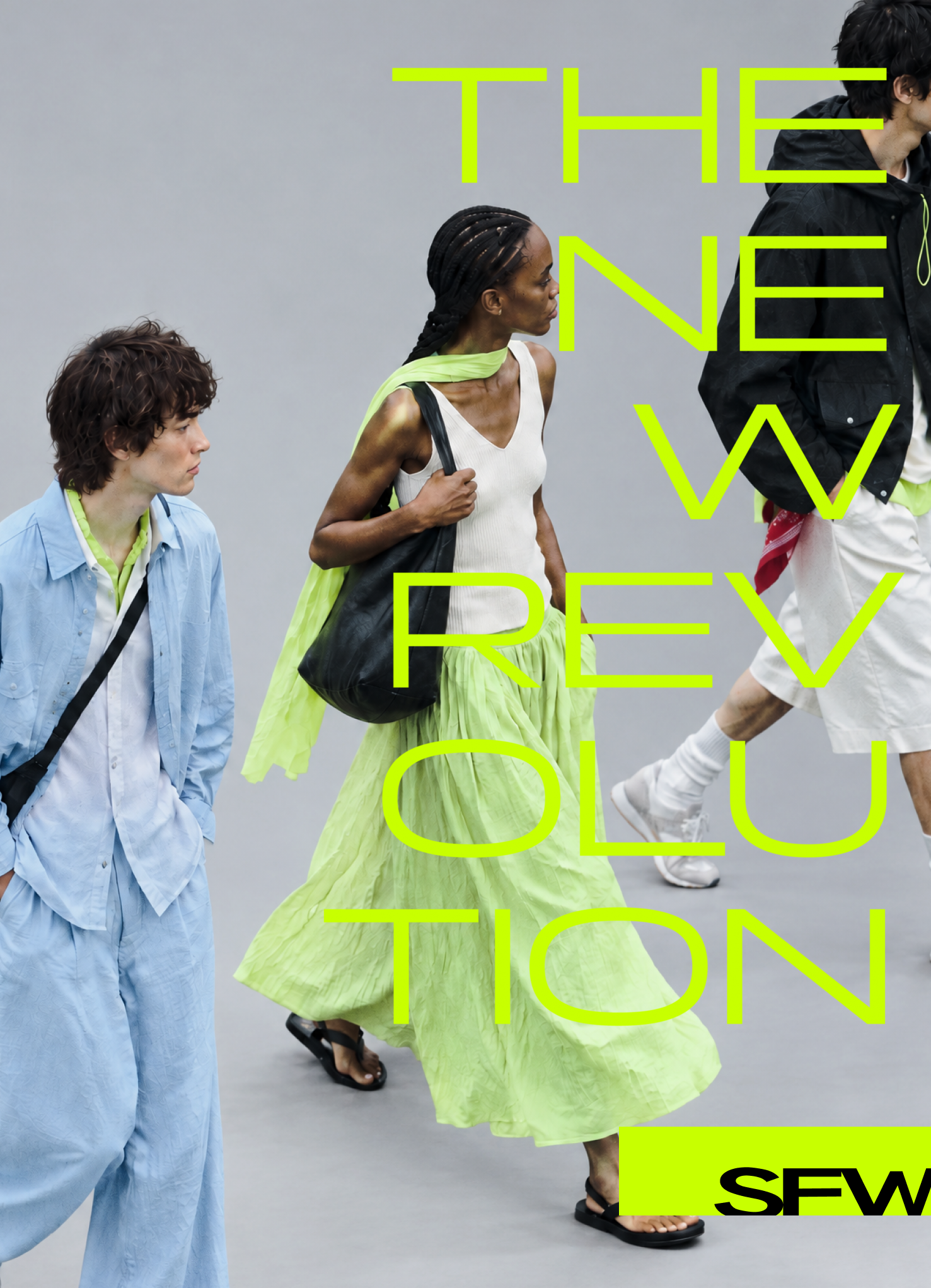
The campaign explores the relationship between typography, clothing and the body. Letterforms are scaled, stretched and arranged to respond to the models’ poses and garment silhouettes, creating a sense of movement and tension across the composition.

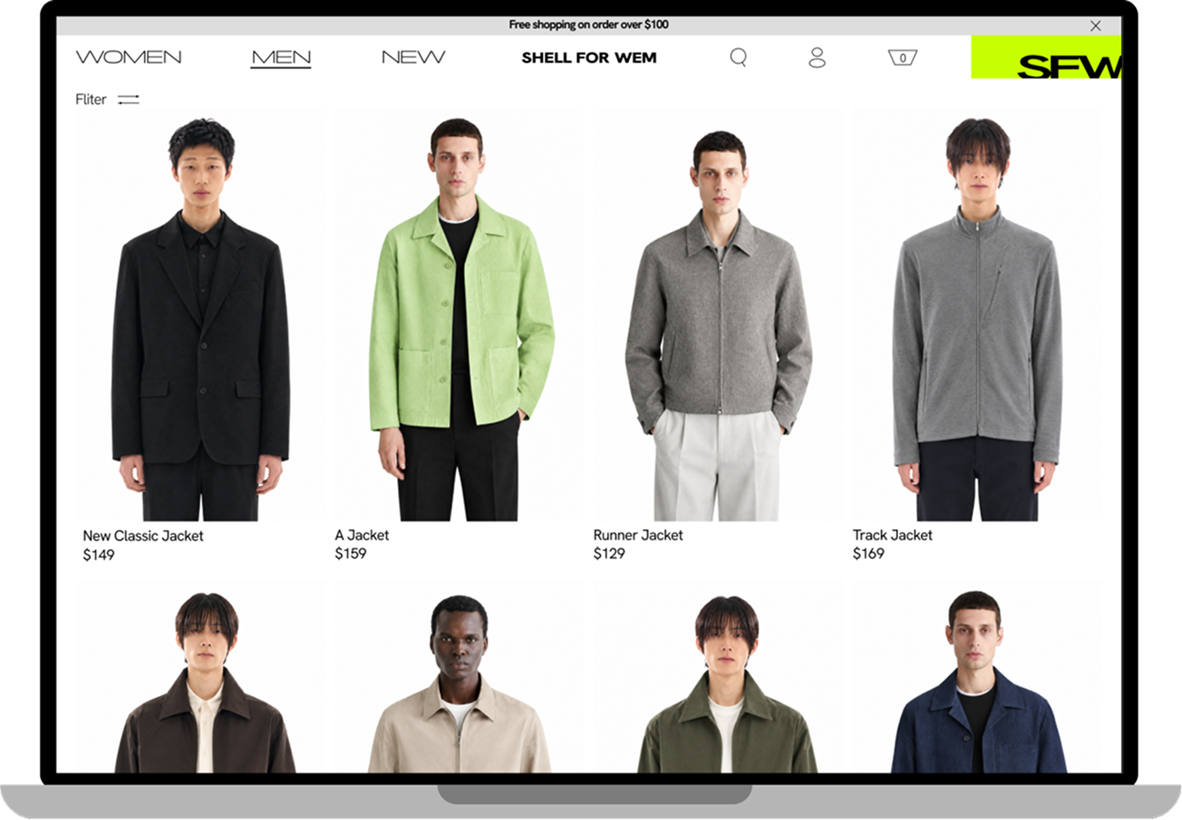
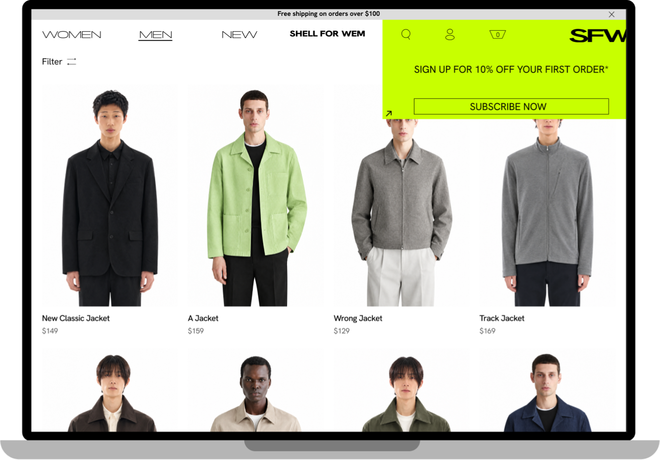
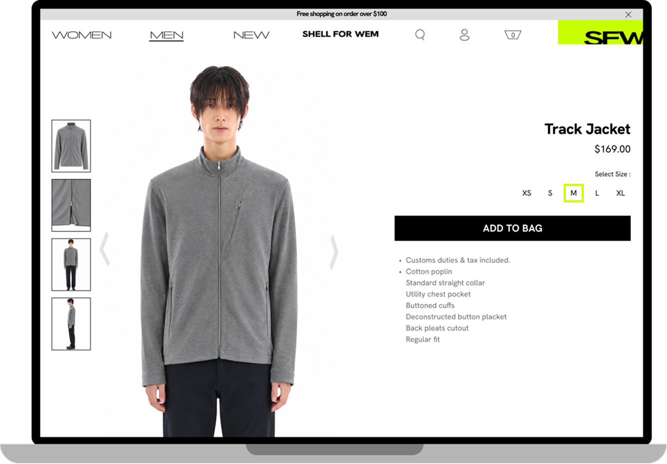
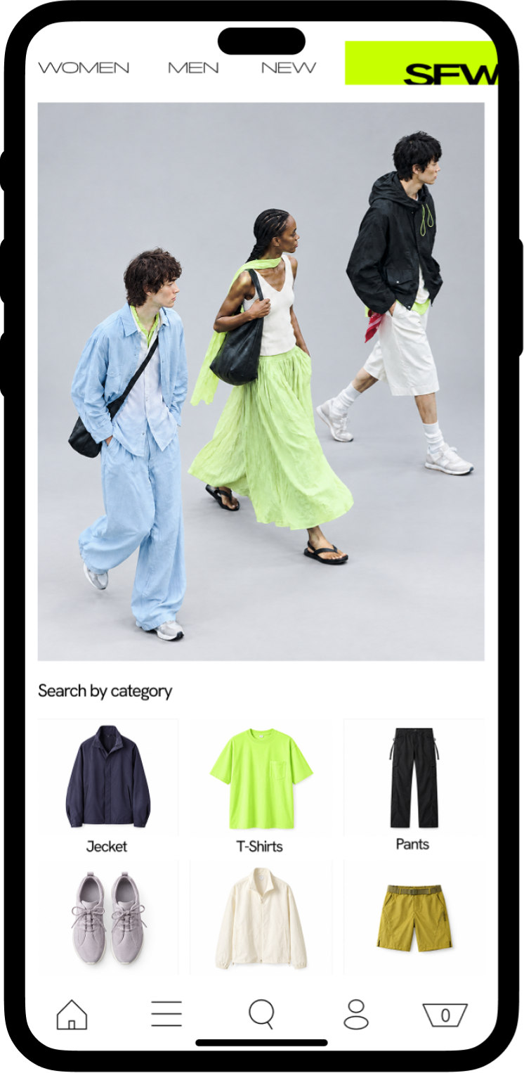
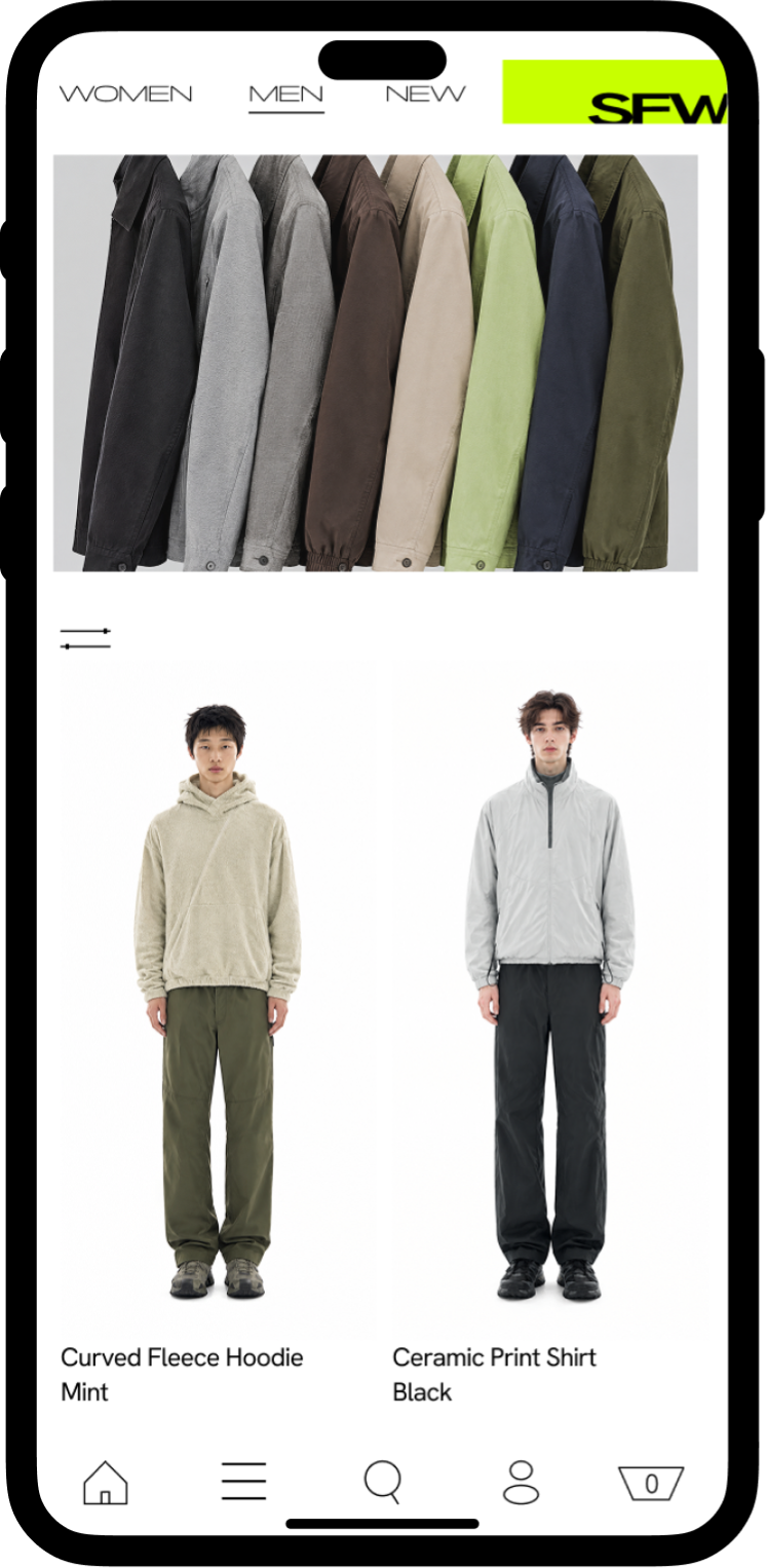
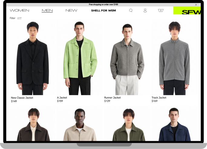
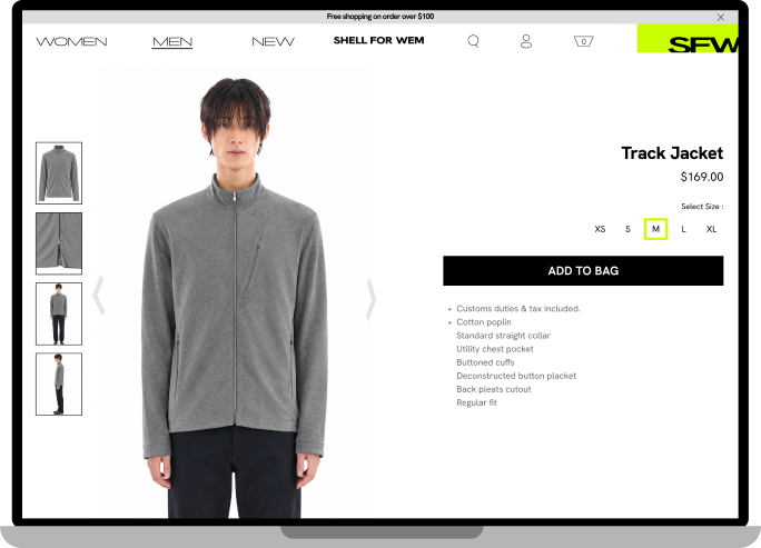
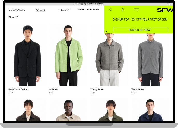
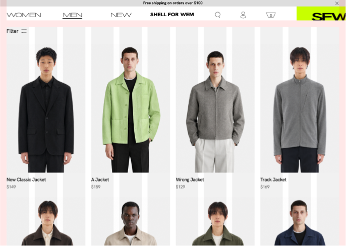
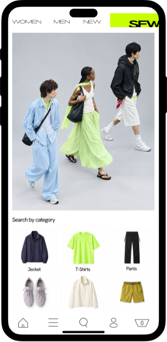
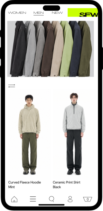
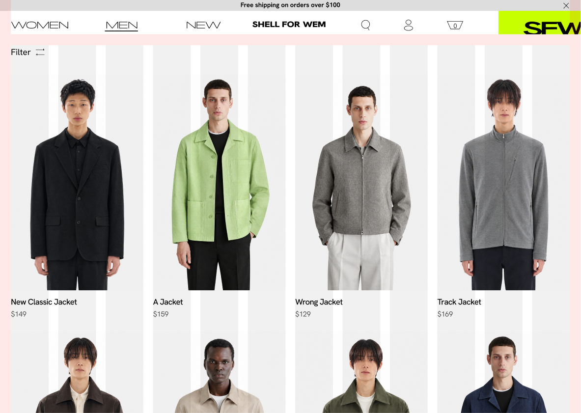
I used structured product layouts, sharp-cornered buttons and a restrained black-and-white palette to give the web and mobile interfaces a clean, direct feel while keeping product imagery prominent. The top-right brand mark connects the brand identity with promotional messaging, extending the “Shell” concept into a flexible space for changing offers within a consistent framework.

E-Commerce

​

Desktop / Product listing / Image mockup
Desktop / Product listing / Alternate mockup
Desktop / Product detail / Image mockup

​

A shared 12-column grid and consistent visual language connect the product listing and detail pages, allowing different layouts to maintain a cohesive brand experience.

Laptop mockup base
Editable layout 1
Mobile / Homepage / Device mockup
Mobile / Product listing / Device mockup
iPhone hardware frame

This project shifted my approach from designing individual visuals to building a cohesive visual system. By developing reusable templates and consistent design rules, I gained a deeper understanding of how repetition and structure can strengthen a brand's visual identity across multiple touchpoints.

Logo / SFW / Lockup / Primary

Art direction & design

Ziang Chen

Fashion imagery generated with AI for concept presentation only.

Shell For Wem is a contemporary fashion label that explores the tension between everyday dressing and experimental expression. Its visual identity balances fluorescent green, unconventional typography and controlled studio photography with structured layouts, creating a distinctive and consistent language across digital and physical touchpoints.
Logo / SFW / Lockup / Primary

Logo

The logo is built around the concept of a “Shell”—a defined boundary that establishes structure while allowing room for variation. Within this framework, letterforms are stretched and cropped, transforming familiar typographic forms through shifts in proportion and creating visual tension.

Logo / Clear space diagram / 1x. 1x 1x 1x 1x
Logo / SFW / Lockup / Primary
Logo / Alternate lockup

Visual System

Hex: C8FF00

Pantone: 2297C

Primary Typeface

Panchang

Secondary Typeface

Hanken Grotesk

Typeface Hierarchy

Scale

Weight

Tracking

Display

Medium

500

Wide

+2%

Heading

3×

48 px

Semibold

600

Tight

−3%

Subheading

1.5×

24 px

Semibold

600

Normal

0%

Body

1×

16 px

Regular

400

Normal

0%

6×

96 px

05 / Layout system & brand mark guidelines. Layout System The brand mark is selectively applied across digital and physical touchpoints. When used, it follows a consistent alignment and spacing system to maintain visual coherence. The brand mark anchors to the bottom-right corner of its rectangular container, whether that is the full composition or a smaller rectangle within it. Brand Mark Guidelines Full-frame container or Nested container Campaign Social Media Graphic
Social Media

Layouts, typography and imagery are adapted from the templates to suit different content and communication needs, maintaining a recognisable brand identity while allowing flexibility across posts and stories.
Campaign
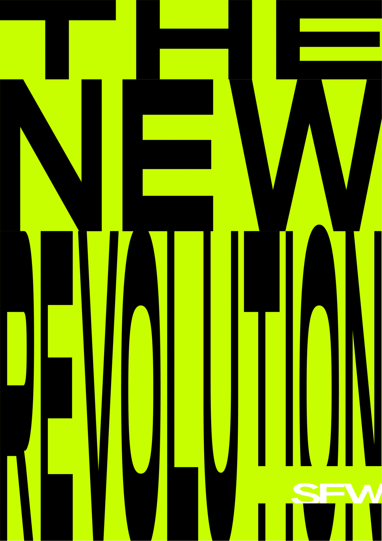
The campaign explores the relationship between typography, clothing and the body. Letterforms are scaled, stretched and arranged to respond to the models’ poses and garment silhouettes, creating a sense of movement and tension across the composition.

Laptop mockup base

E-Commerce

I used structured product layouts, sharp-cornered buttons and a restrained black-and-white palette to give the web and mobile interfaces a clean, direct feel while keeping product imagery prominent. The top-right brand mark connects the brand identity with promotional messaging, extending the “Shell” concept into a flexible space for changing offers within a consistent framework.

Desktop / Product listing
Desktop / Product detail
Desktop / Alternate listing
Editable layout 2

A shared 12-column grid and consistent visual language connect the product listing and detail pages, allowing different layouts to maintain a cohesive brand experience.

Mobile / Homepage / Device mockup
Mobile / Product listing / Device mockup
iPhone hardware frame

This project shifted my approach from designing individual visuals to building a cohesive visual system. By developing reusable templates and consistent design rules, I gained a deeper understanding of how repetition and structure can strengthen a brand's visual identity across multiple touchpoints.